I Replaced Dashboards with One Line of Text
I connected my two SaaS products to Claude MCP. No more dashboards — just ask in plain English and the data comes back. Dashboard 4-click workflow vs one-line natural language query.
April 2026 · Lazy Developer EP.11
In EP.10, I built a personal AI assistant with MCP. 13 modules, 50 tools. Ask “how’s today?” and it summarizes everything from revenue to calendar events.
But there was a problem. Having 50 tools means nothing if the data is wrong. Connecting my two SaaS products — Apsity and FeedMission — required a fair amount of fixing. This episode is about that process.
– Connected my 2 SaaS products (Apsity, FeedMission) to MCP
– Dashboard 4-click workflow replaced by one line of natural language
– 12 tools + 5 blog (GoCodeLab) tools
– Cross-service data comparison in a single query
– Dashboards are for “looking.” MCP is for “asking.”
Why I Stopped Using Dashboards
Apsity is an app store analytics service. It tracks revenue, keyword rankings, reviews, and competitor changes for my 12 apps. FeedMission is a feedback management service. It uses AI to classify user feedback, cluster it, and map it to the product roadmap.
Both have dashboards. Log in via the web, look at charts, scan tables, apply filters. I used to open these every morning. (I talked about building the Apsity dashboard in EP.02.)
The thing is, dashboards only answer when you ask. Click a menu, change the date range, select an app. To find out “how much revenue this week?” takes at least 4 clicks. Once or twice a day is fine, but opening Apsity, then FeedMission, then the blog — before you know it, 30 minutes of the morning are gone.
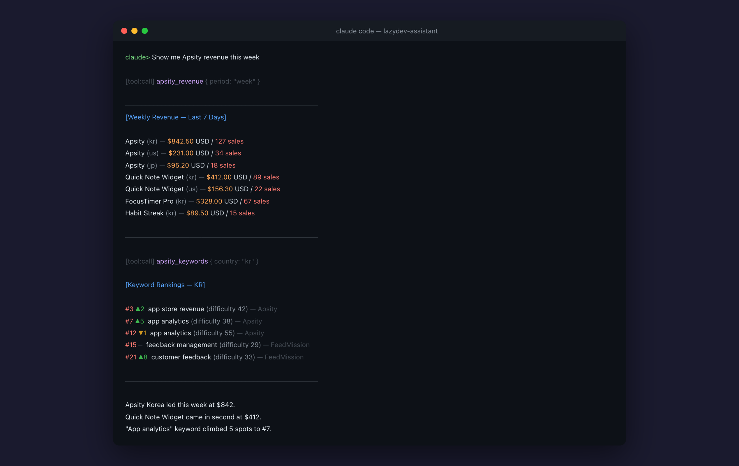
With MCP, that changes. Type “Apsity revenue this week” and you are done. Claude fetches the data.
Wiring Service Data into MCP
Each MCP tool does one simple thing: fetch data from my service and return it as text to Claude. No dashboard needed — Claude reads the data on its own.
Apsity: 6 Tools
First I mapped out what data I needed from Apsity. The same things I looked at on the dashboard every day.
– apsity_revenue: Revenue by app (period, app name, country filter)
– apsity_reviews: Reviews (with star rating, sentiment analysis)
– apsity_keywords: Keyword rankings + change tracking
– apsity_competitors: Competitor metadata changes
– apsity_insights: AI growth insights
– apsity_category_rank: Category rankings
You use it in natural language. Like this:
“Any reviews below 2 stars?” — filters low-rating reviews only
“Competitor metadata changes?” — detects title/description/screenshot changes
Instead of fiddling with dashboard filters, you just ask.
FeedMission: 6 Tools
Same pattern for FeedMission. Feedback, clusters, roadmap, surveys, revenue, stats. Six tools total.
– feedmission_feedback: Recent feedback (status/type filter)
– feedmission_clusters: Feedback clusters (by priority)
– feedmission_roadmap: Roadmap progress status
– feedmission_surveys: Survey status + response count
– feedmission_revenue: Subscription revenue
– feedmission_stats: Dashboard stats summary
Works the same way. “Show me recent feedback” returns items organized by status. “How are survey response rates?” gives you numbers.
GoCodeLab: The Blog Too
GoCodeLab is a WordPress blog. I use a SEO plugin called Rank Math. I connected this to MCP as well.
– gocodelab_posts: List posts
– gocodelab_seo: Check SEO settings
– gocodelab_seo_update: Edit SEO meta
– gocodelab_media: Media library
– gocodelab_post_update: Edit posts
The blog uses the WordPress REST API instead of a direct database connection. Different method from Apsity and FeedMission, but the MCP tool structure is the same. Take parameters, fetch data, return text.
Ask “how are blog post views this week?” and you get the answer. No need to log into the WordPress admin panel.
Verifying Data Accuracy Comes First
Building tools is fast. What actually took time was validation.
If I ask “this week’s revenue” and a wrong number comes back, that is a problem. The numbers from MCP have to match the numbers on the dashboard. For every tool I built, I cross-checked the results against the dashboard.
FeedMission’s stats tool returned slightly different numbers at one point. The aggregation logic was a bit off compared to the dashboard. Catching this kind of thing means comparing results one by one. Twelve tools, twelve checks. It does not matter how many tools you have if the data is wrong.
Dashboards vs Natural Language
Here is the comparison.
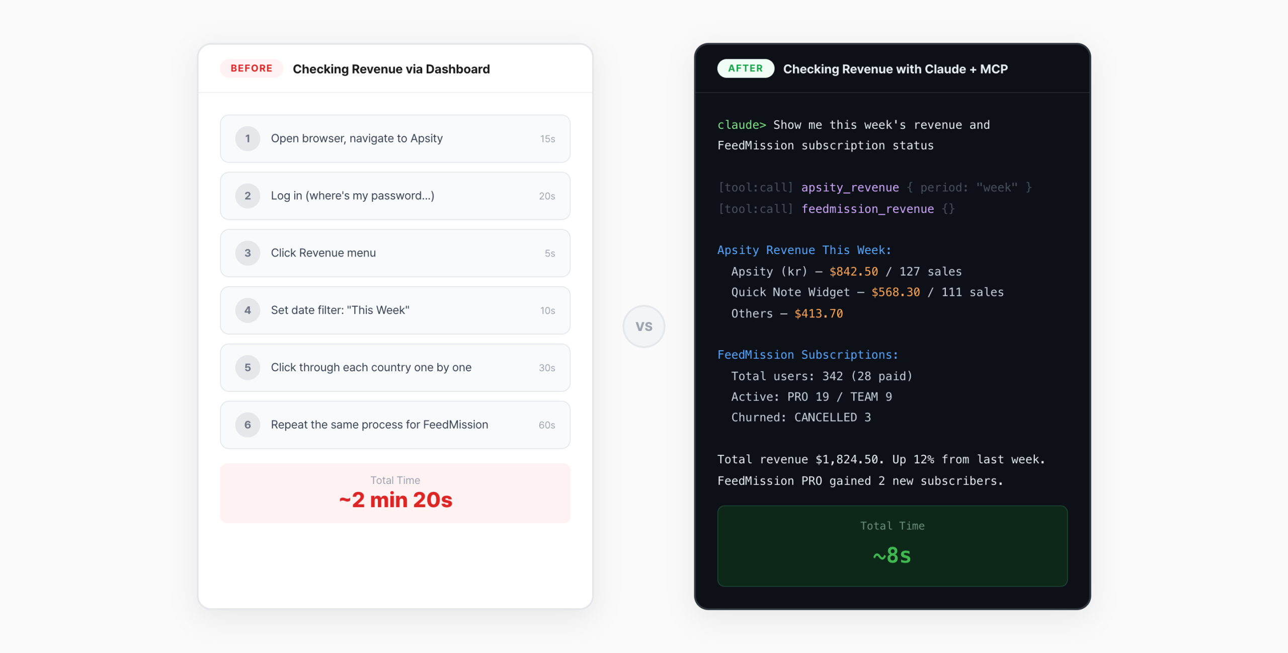
With a dashboard: open browser, log in, pick a menu, set filters. Four steps before you see a number. With MCP: “Apsity revenue this week.” Done. Claude fetches it.
What is even better is cross-service comparison. “Show me Apsity revenue and FeedMission subscriber count together” — data from both services comes back at once. No need to put two dashboards side by side.
The key shift is from “checking” to “asking.” Dashboards require you to know what to look at. Natural language queries let you just ask what you are curious about.
The Module Pattern Pays Off
The module pattern from EP.10 proved its worth here. Every tool follows the same structure.
export const tools: ModuleTools = {
tool_name: {
description: ‘Description’,
params: z.object({ /* parameter definitions */ }),
handler: async (params) => {
// Fetch data and return as text
},
},
}
Adding a new tool means filling in the name, description, and handler in this template. One line of registerModule() in server.ts puts it on MCP. Building 12 tools across Apsity (6) and FeedMission (6) took a day and a half. More time went into data validation than building the tools themselves.
What I Learned
Three things.
1. Data accuracy is everything. Tool count does not matter. Fifty tools mean nothing if one query is wrong — the AI gives a wrong answer. Checking queries against the DB schema comes first.
2. It is my service, so I can connect directly. With an external service, you would need their API. Since these are my own products, I can fetch data directly. No middleman, so it is fast and simple.
3. Dashboards are for “looking.” MCP is for “asking.” Dashboards show predefined charts. MCP lets you ask whatever you want. A question like “top 3 revenue apps this month?” requires filter gymnastics on a dashboard. With MCP, it is one line.
What Comes Next
MCP lets me read data now. But it still only works from the terminal. I have to be at my computer. I wanted it to work from anywhere. So I connected it to Telegram. Send “how’s revenue?” from my phone and the answer comes back. That story is in EP.12.
Down the line, I am planning to open MCP access for subscribers. Apsity subscribers querying their own data through Claude. But that is still in the planning stage.
FAQ
Q. What is the benefit of connecting SaaS data via MCP?
You never open a dashboard. Ask “how much revenue this week?” and the AI fetches the number. You can compare data across multiple services in a single query.
Q. Is the MCP server secure?
The MCP server runs only on my local Mac mini. It is not exposed externally. Only I use it. Credentials are managed through environment variables.
Q. What are Apsity and FeedMission?
Both are SaaS products I built. Apsity is an app store revenue/keyword/review analytics service. FeedMission is a service that classifies user feedback with AI. Earlier episodes of this blog covered how I built them.